
"Fall under the spell"
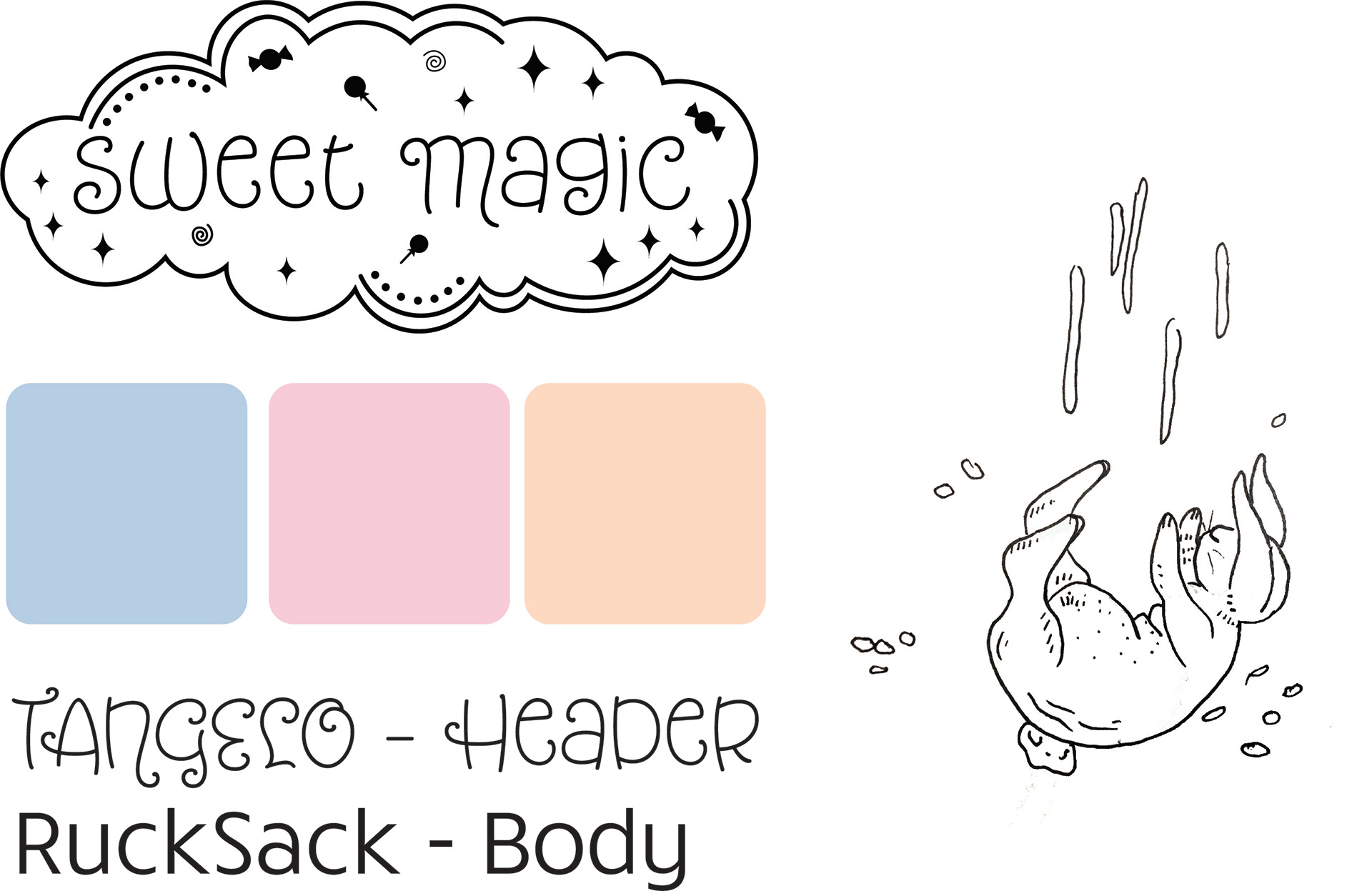
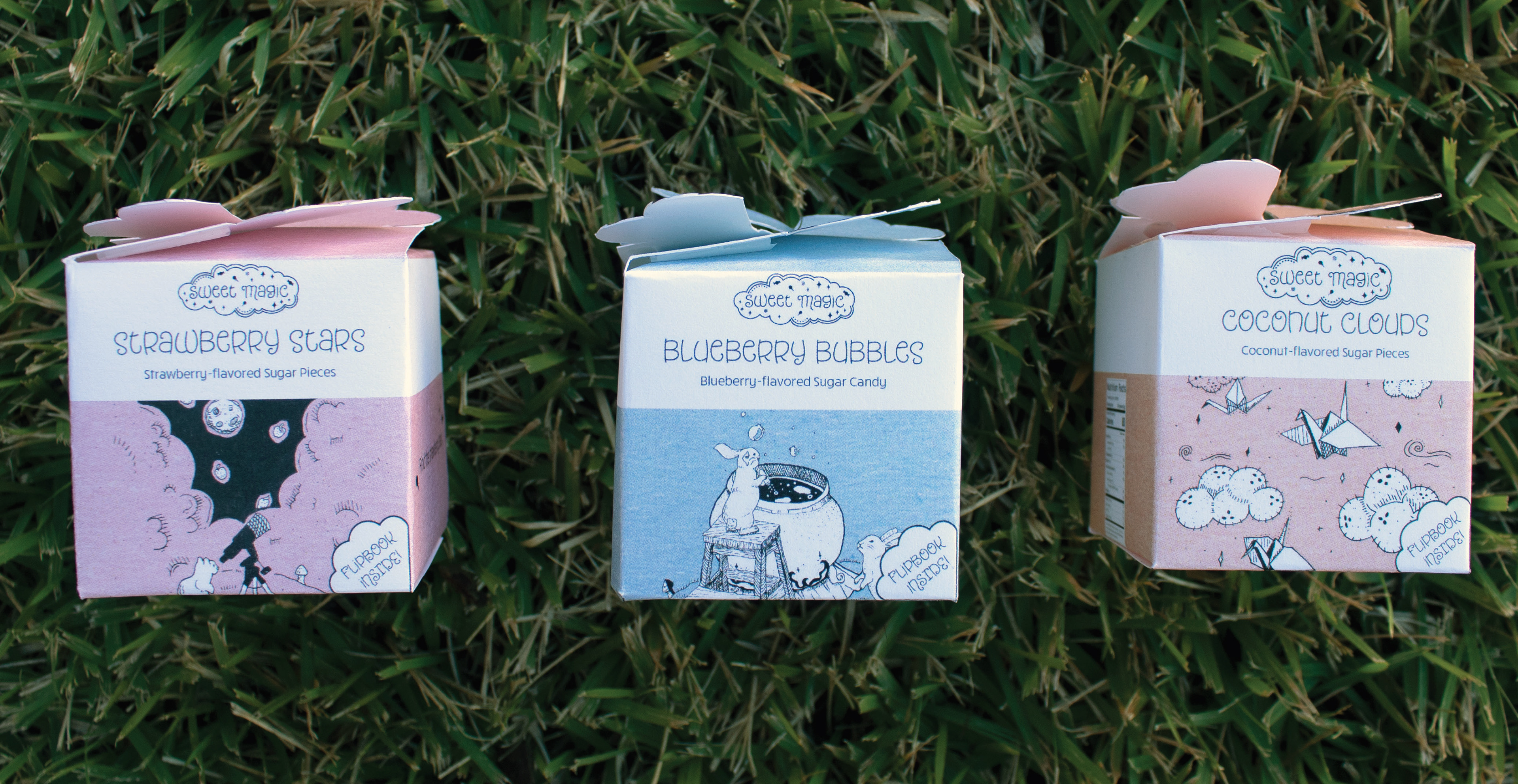
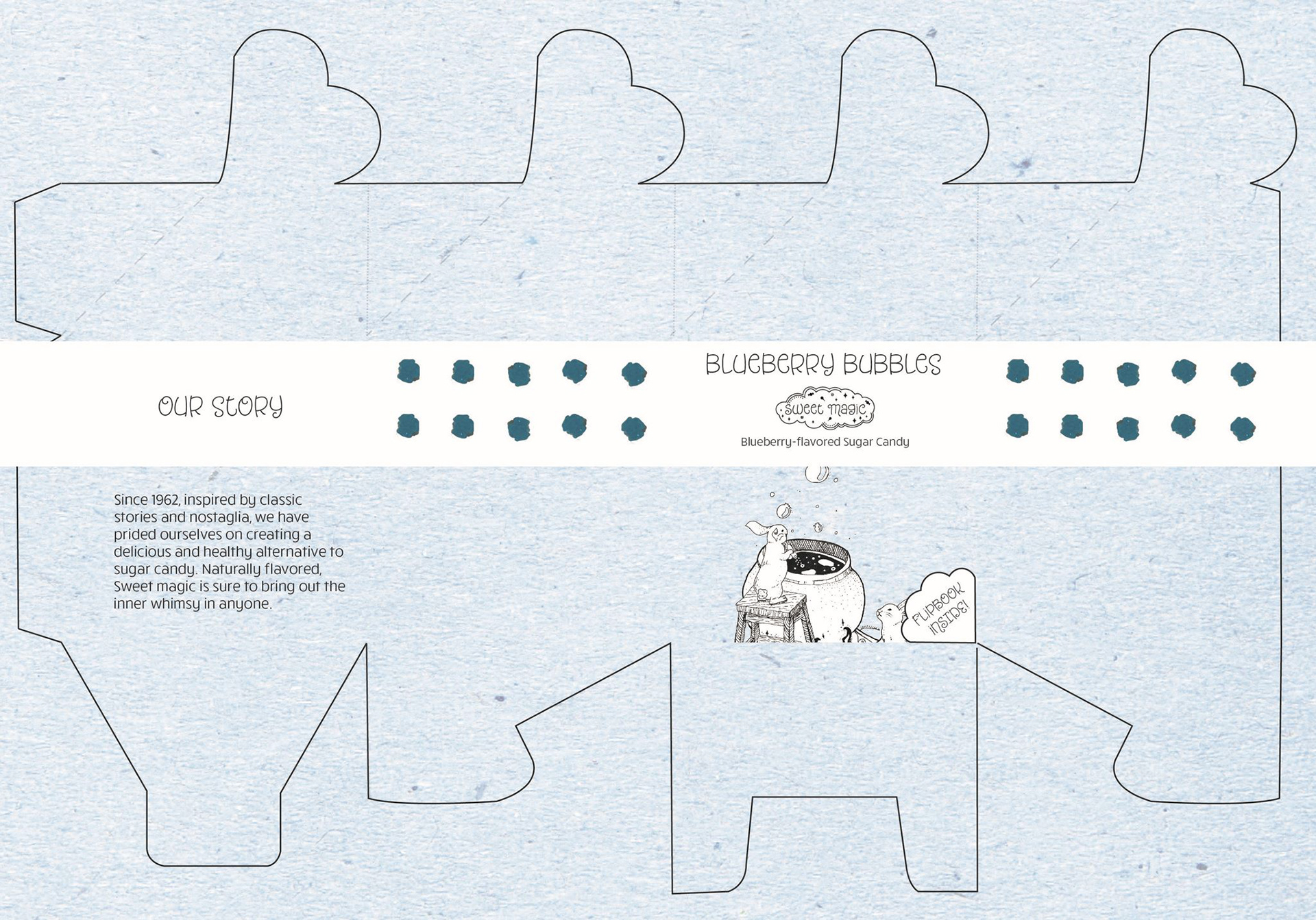
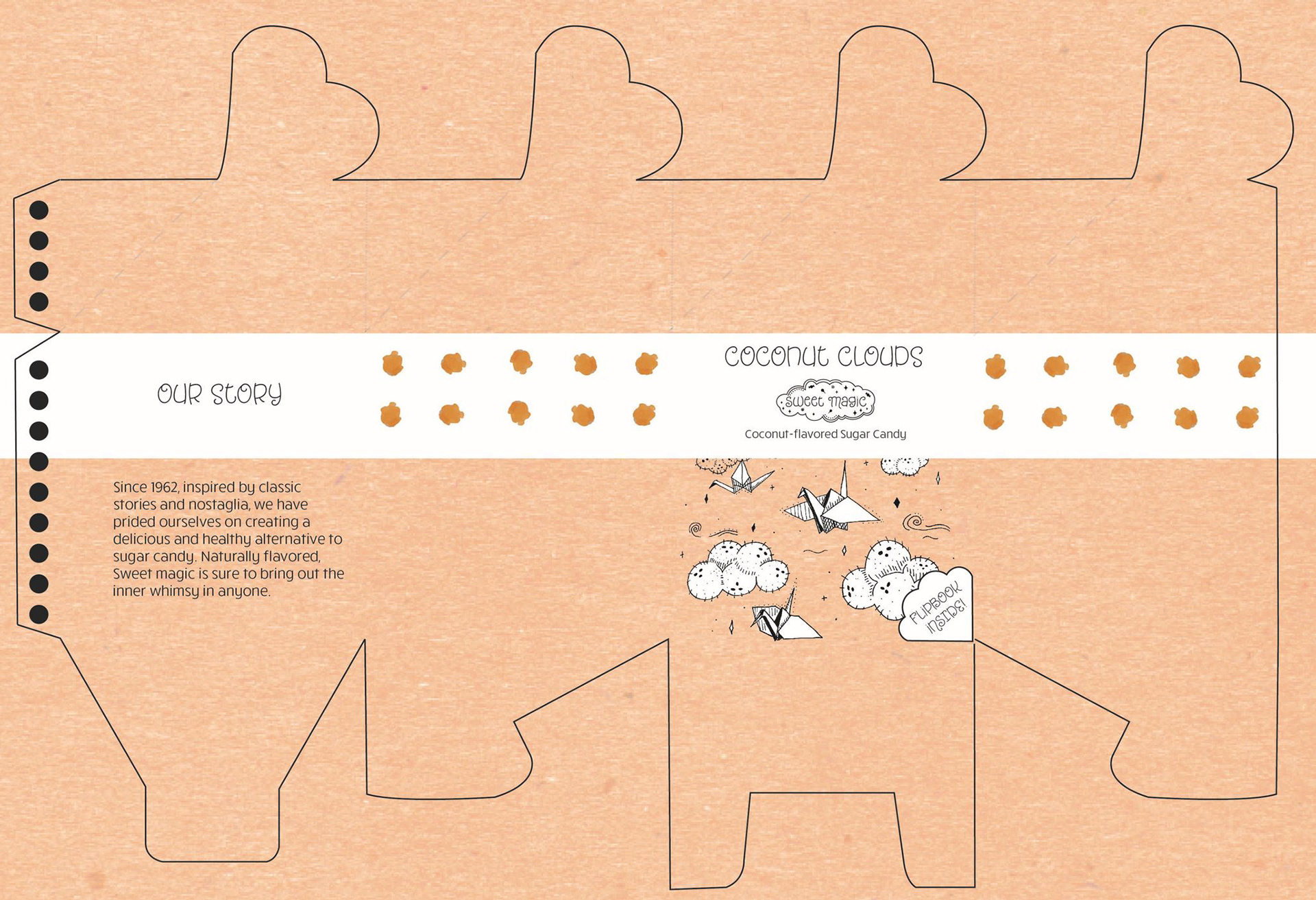
The design challenge for this project was to create a brand that has packaging. The solution to designing this product was to keep the major concepts of nostalgia and childhood in mind. This brand aims to deliver candy through use of whimsical and children's books style illustrations. While the packages are kept relatively simple through use of one color, each contain a unique illustration for the flavor of the product. The clover-top closure of the package emphasizes the use of storybook-style design. The type was chosen to be inviting and friendly.
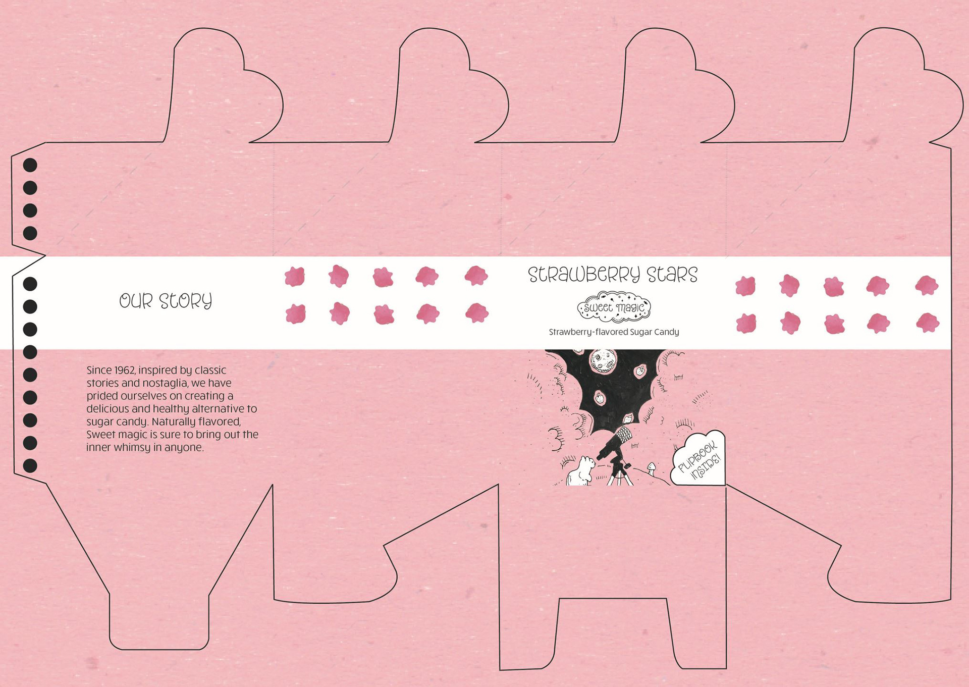
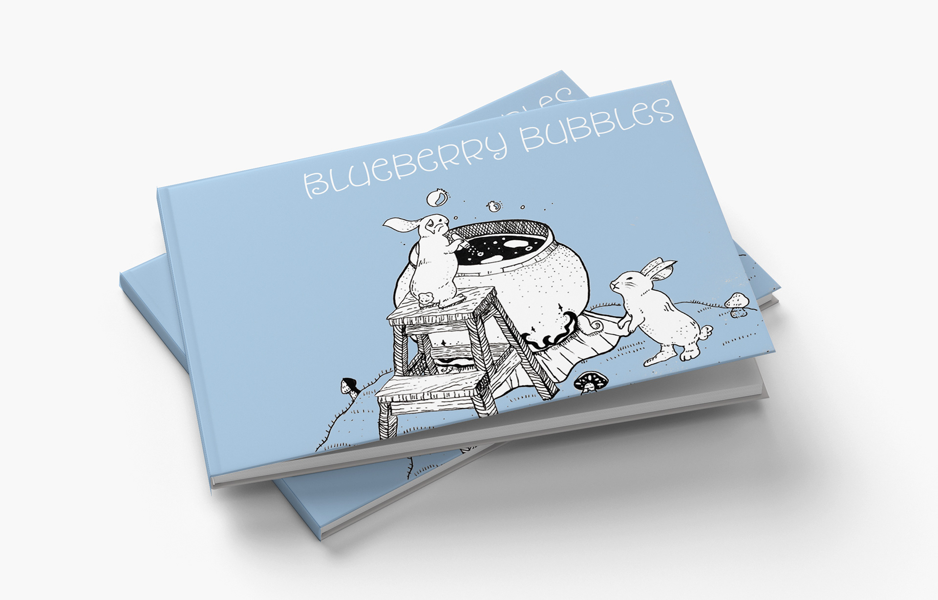
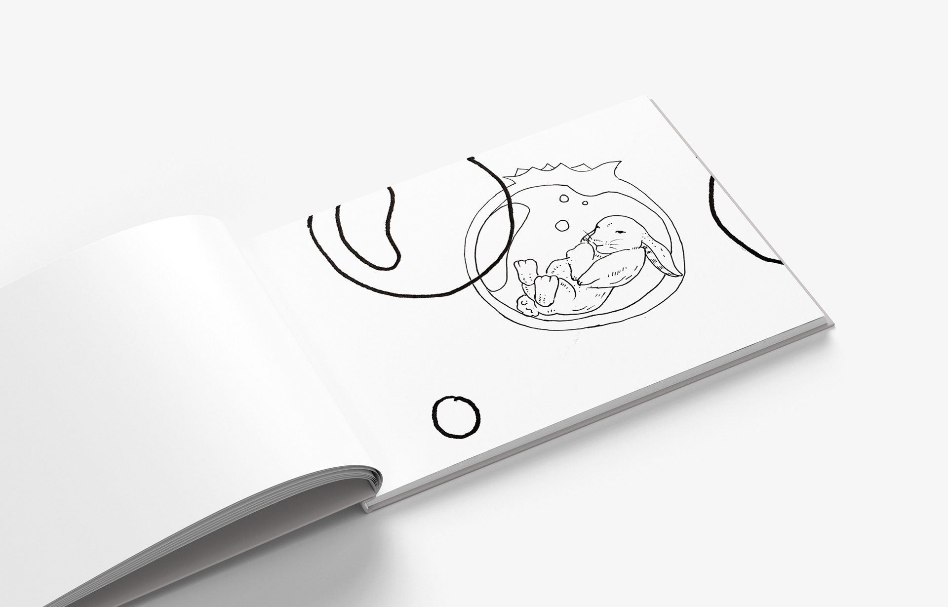
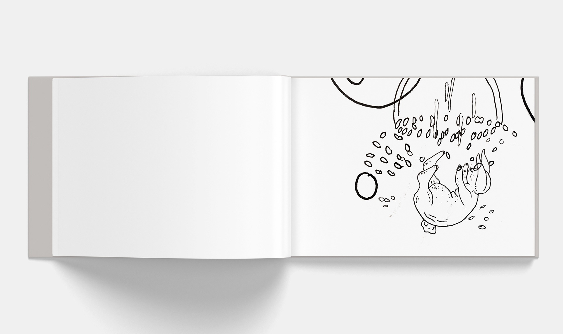
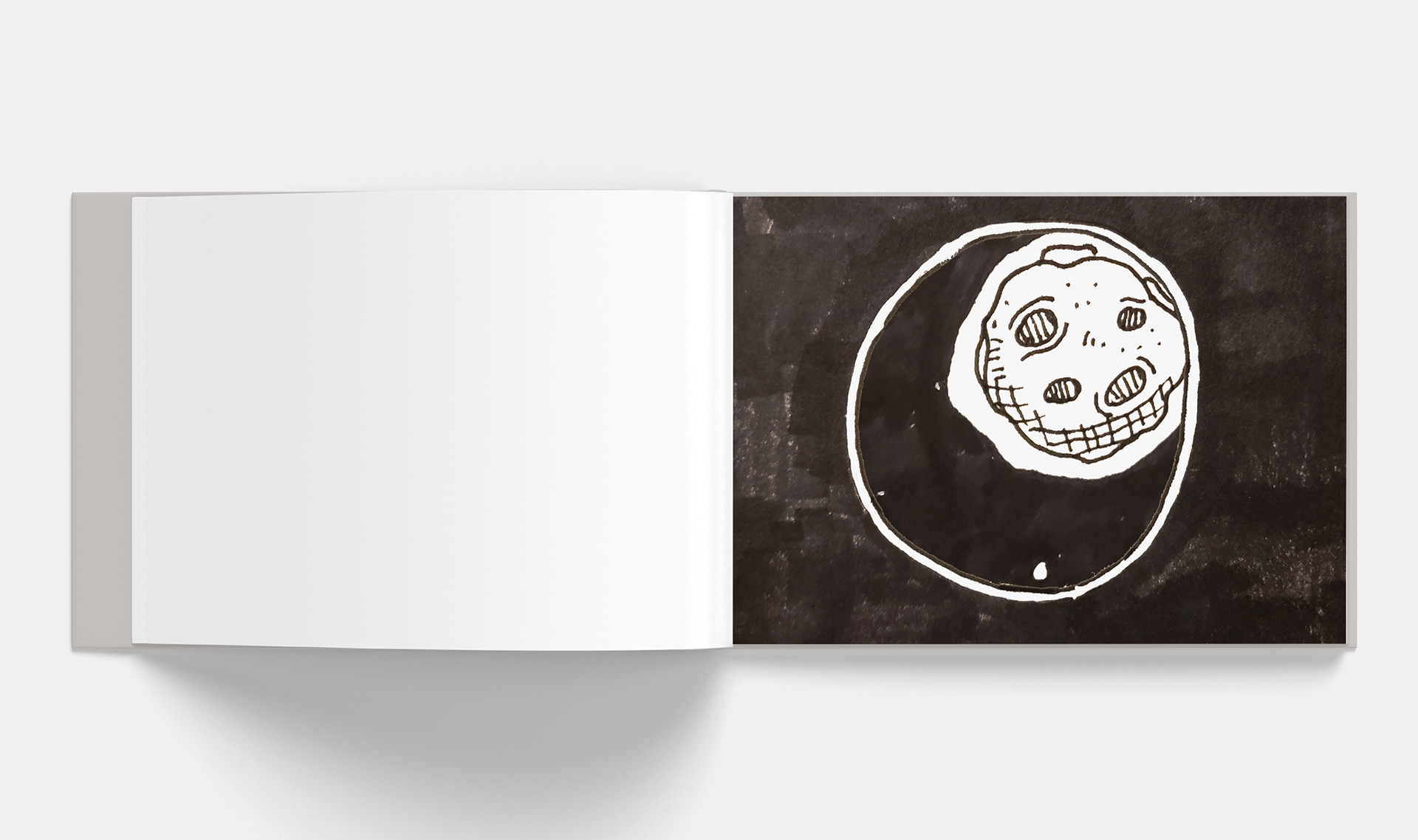
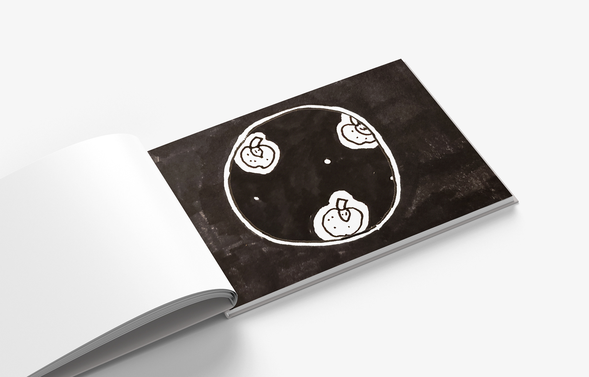
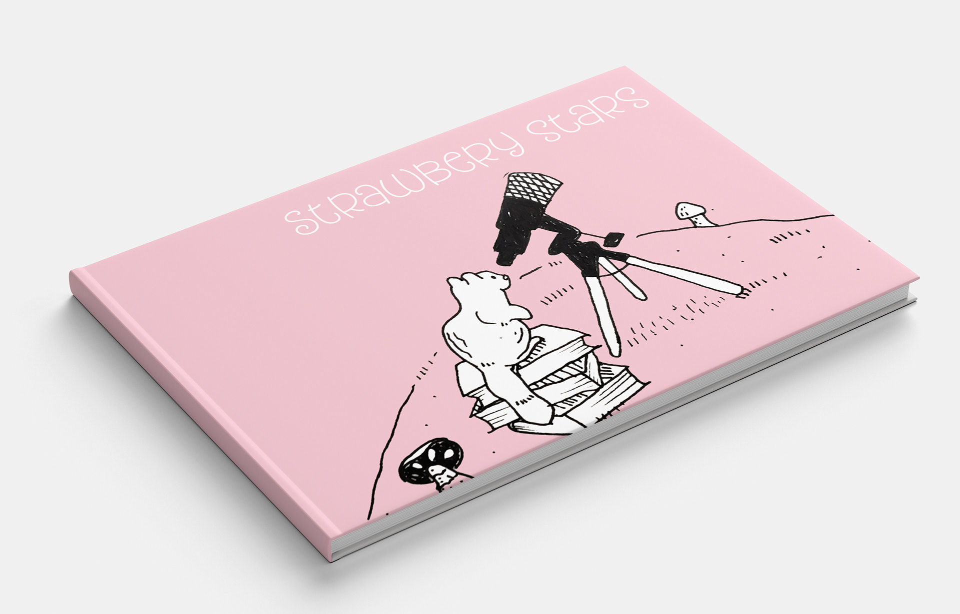
Another major aspect to these products is the unique flipbook that is included with the different flavors. This gives the audience incentive to collect all of the books. The books are fully illustrated with ink and remain in black and white to keep the traditional feel. The cover of the book utilizes the color of the product to set it apart from the alternative flipbooks.